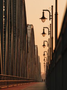
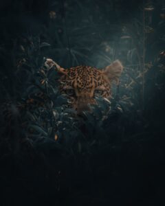
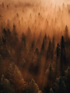
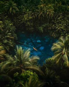
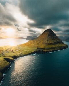
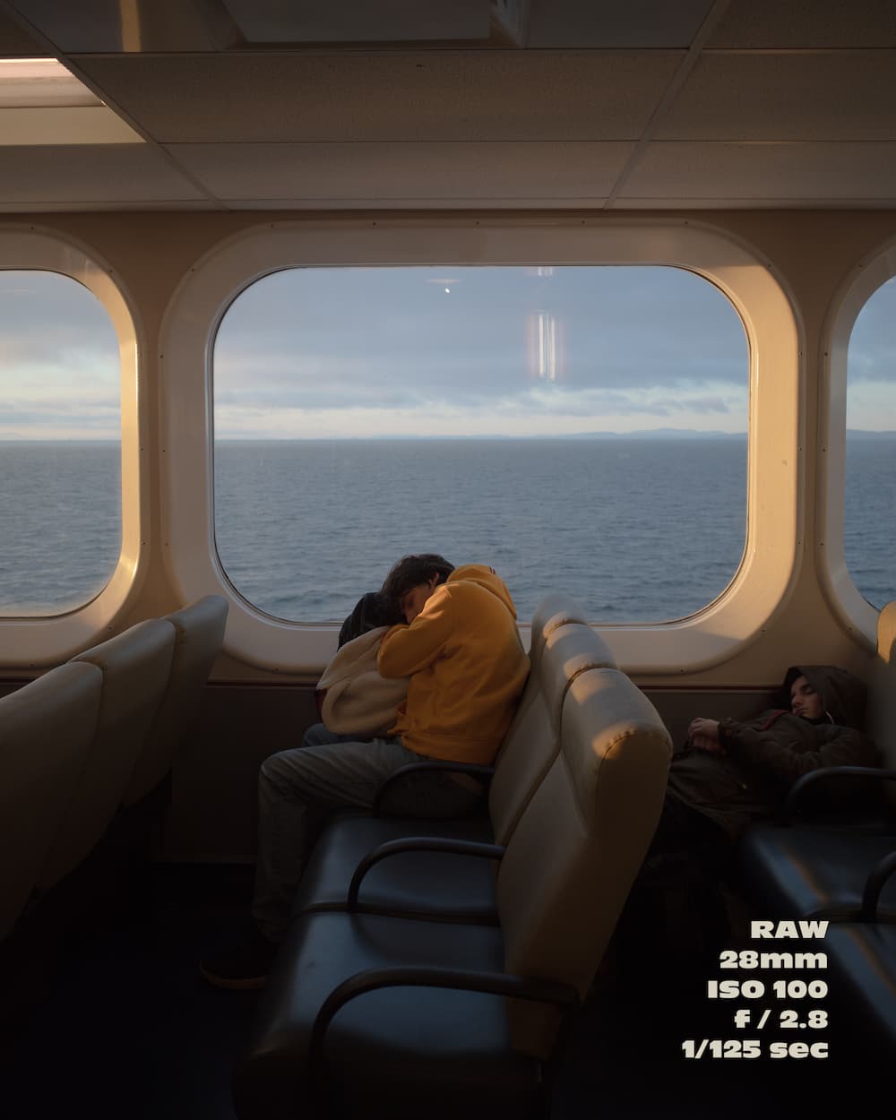
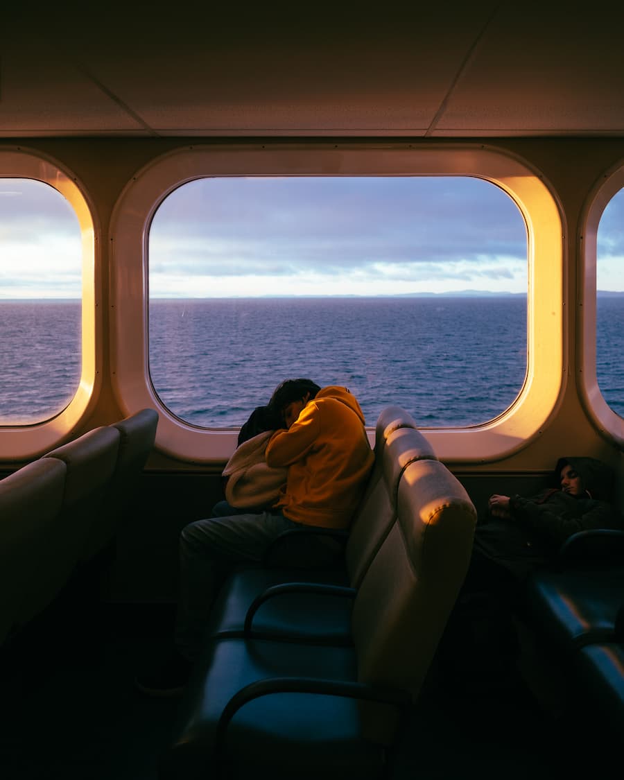
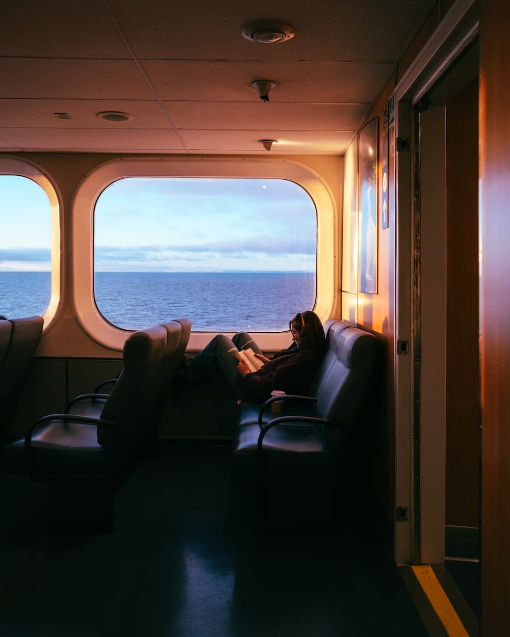
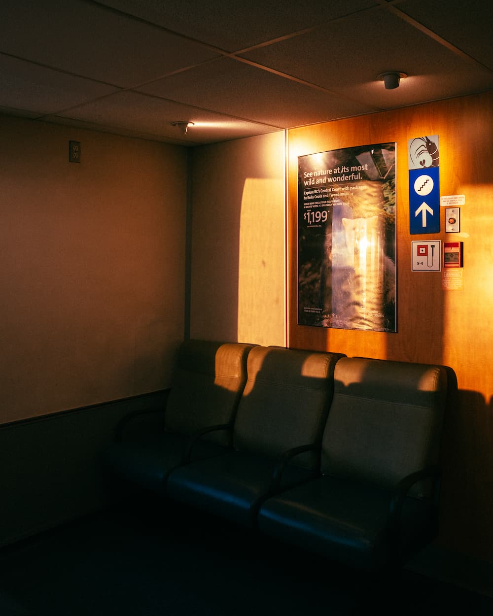
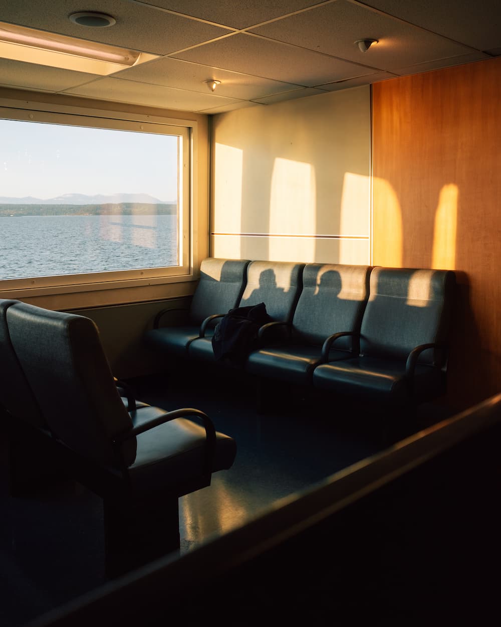
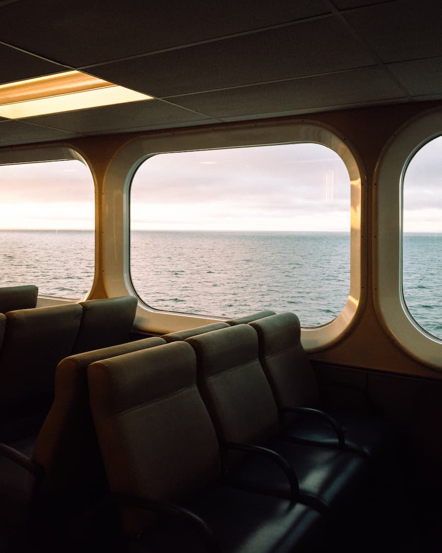
How to edit your travel indoor sunrise images step by step!

With Harry Sohal

The image on the right side of this article is one of Harry’s most celebrated photos on social media, with over 100,000 likes. To help you understand the success of this photo, Harry has provided a step-by-step guide to the image and its color grading, including presets for you to easily follow and try!


I captured this series en route to Vancouver Island for a hiking trip with friends. While most passengers on the early morning ferry were tired and half-asleep, I seized the opportunity to capture the stunning light and take as many shots as possible.

In this series, you can find some of my favorite shots from that sunrise and the editing breakdown I followed to give them my style, taking as an example the first image of this series:

Step 1) Camera settings

The camera settings I used were 1/125 seconds, f/2.8, and ISO 100.

Step 2) Understand the unedited colors

The RAW file already had an atmospheric palette with a dark brown/black (120E0E), a dark brown (3E3026), a muted blue/grey (7D8894), a muted brown (665447), and a light beige (C6B8A8).

My vision was to create a color palette that enhanced the essence of the sunrise. I looked for a harmonious blend of warm and cool tones to add vibrancy and contrast. To do so, using Lightroom, I adjusted the image as follows:

Step 3) Basic adjustments

3.1) White Balance
Temperature 4,523
Tint +1

3.2) Tone
Contrast -46
Highlights -64
Shadows +46
Whites +37

3.3) Presence
Texture -10
Clarity -10
Dehaze -10

Step 4) Tone Curve

Below I demonstrate how I worked on the RGB channels for precise control over tonal values. This approach helps correct color casts and enhance specific colors more naturally.

On color grading

Step 5) Color Mixer

5.1) Hue
Red +10
Orange +10
Green +10

5.2) Saturation
Red -19
Yellow -10
Green -46
Aqua -10
Blue +10
Purple -10
Magenta -10

5.3) Luminance
Red -28
Orange -10
Yellow -10
Green -19
Blue -19
Magenta -19

Step 6) Calibration

Red Primary
Hue +19
Saturation -10

Green Primary
Hue +19
Saturation -28

Blue Primary
Hue -10
Saturation +19

On color theory

Step 7) Color theory

As a result, I obtained a split-complementary color palette with an accent – the yellow provides a striking focal point. The deep green (10130D) and the earthy brown (573725) add significant depth and contrast, grounding the overall composition. The muted blue-gray (676D90) and the soft pale blue (C2CCDF) add tranquility, balance, and a touch of vibrancy compared to the original. The bright golden yellow (F5C871) serves as an accent color, adding contrast to the otherwise analogous palette.

THE LATEST STORIES

WRITEN WITH PASSION TO INSPIRE YOU
Nomadict_Matterhorn_1

Jay Blatti (@jayblatti): Best of the week 46 at #nomadict 2024

Jay is a passionate traveler and photographer whose curiosity drives him to explore both faraway landscapes and hidden gems in his own country. In this article, he shares how travel and photography intertwine as journeys of discovery, growth, and creativity. Jay shares insights into his process, the lessons he’s learned, and the story behind the photograph that won the Best of the Week 46, 2024.

Winner photo_Stokksness_Icelnd_buerklestories

Carina & Max (@buerklestories): Best of the week 1 at #nomadict 2025

Max and Carina are passionate photographers who transform every journey into a discovery of nature’s unique moods and moments. Their work captures the interplay of light and shadow, and through a deep understanding of key elements, they create images that tell a story and evoke emotion.

@ericdsyv_Eric Deseyve_Nomadict_4

Eric Deseyve (@ericdsyv): Photographer based in Germany

Eric is a passionate landscape photographer based in Germany whose love for travel and the outdoors blossomed during the pandemic. A trip to the Dolomites in 2022 turned his hobby into a deeper pursuit, leading him to capture breathtaking landscapes with both his camera and drone. Eric now combines his hobby with professional gigs.

Tree-of-life-sRGB-sharpened-sharpened-@isabellandscapes

Isabella Tabacchi (@isabellandscapes): Landscape photographer based in Italy

Since our first interview, Isabella has explored some of the world’s most breathtaking regions, earning accolades such as the ILPOTY and MIFA awards. Known for her ability to evoke emotion and redefine landscapes through her lens, she constantly challenges herself to push creative boundaries. Today, we dive into her adventures, creative evolution, and the stories behind her stunning works.

@long.explorer Nomadict Best of the Week

Long-Nong Huang (@long.explorer): Best of the week 42 at #nomadict 2024

In this artile, Long reflects on a transformative year of creative growth, exploring new ways to tell visual stories and collaborating with like-minded creators. Through personal anecdotes, client projects, and insights into his artistic process, Long shares his journey of finding inspiration and pushing the boundaries of his craft.

Winning photo (Mu Cang Chai, Vietnam)_@the_prabster

Prabu Mohan (@the_prabster): Best of the week 29 at #nomadict 2024

In this article, Prabu shares his journey from discovering photography in Vietnam to leading successful photography tours, highlighting the creative process behind his work. With a blend of personal insights and practical advice, Prabu offers inspiration and guidance for aspiring photographers seeking to refine their craft.