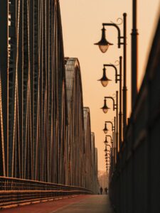
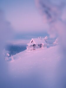
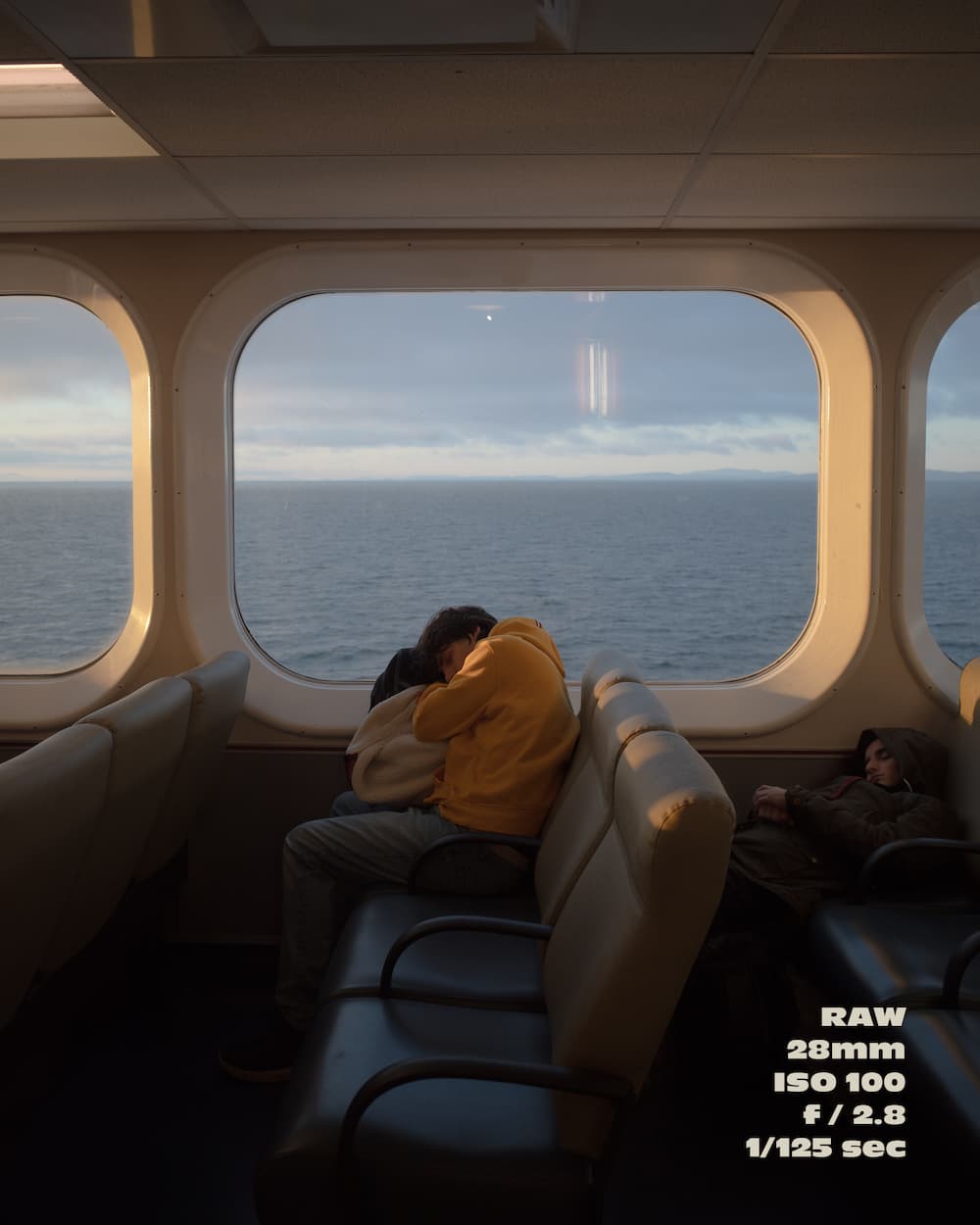
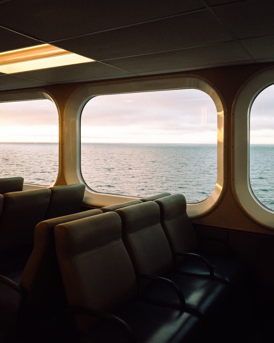
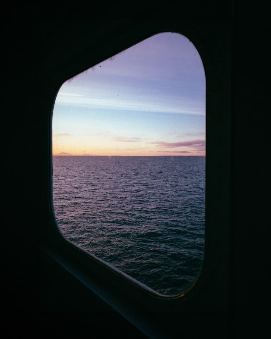
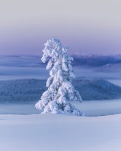
How to edit your travel indoor sunrise images step by step!

With Harry Sohal

The image on the right side of this article is one of Harry’s most celebrated photos on social media, with over 100,000 likes. To help you understand the success of this photo, Harry has provided a step-by-step guide to the image and its color grading, including presets for you to easily follow and try!


I captured this series en route to Vancouver Island for a hiking trip with friends. While most passengers on the early morning ferry were tired and half-asleep, I seized the opportunity to capture the stunning light and take as many shots as possible.

In this series, you can find some of my favorite shots from that sunrise and the editing breakdown I followed to give them my style, taking as an example the first image of this series:

Step 1) Camera settings

The camera settings I used were 1/125 seconds, f/2.8, and ISO 100.

Step 2) Understand the unedited colors

The RAW file already had an atmospheric palette with a dark brown/black (120E0E), a dark brown (3E3026), a muted blue/grey (7D8894), a muted brown (665447), and a light beige (C6B8A8).

My vision was to create a color palette that enhanced the essence of the sunrise. I looked for a harmonious blend of warm and cool tones to add vibrancy and contrast. To do so, using Lightroom, I adjusted the image as follows:

Step 3) Basic adjustments

3.1) White Balance
Temperature 4,523
Tint +1

3.2) Tone
Contrast -46
Highlights -64
Shadows +46
Whites +37

3.3) Presence
Texture -10
Clarity -10
Dehaze -10

Step 4) Tone Curve

Below I demonstrate how I worked on the RGB channels for precise control over tonal values. This approach helps correct color casts and enhance specific colors more naturally.

On color grading

Step 5) Color Mixer

5.1) Hue
Red +10
Orange +10
Green +10

5.2) Saturation
Red -19
Yellow -10
Green -46
Aqua -10
Blue +10
Purple -10
Magenta -10

5.3) Luminance
Red -28
Orange -10
Yellow -10
Green -19
Blue -19
Magenta -19

Step 6) Calibration

Red Primary
Hue +19
Saturation -10

Green Primary
Hue +19
Saturation -28

Blue Primary
Hue -10
Saturation +19

On color theory

Step 7) Color theory

As a result, I obtained a split-complementary color palette with an accent – the yellow provides a striking focal point. The deep green (10130D) and the earthy brown (573725) add significant depth and contrast, grounding the overall composition. The muted blue-gray (676D90) and the soft pale blue (C2CCDF) add tranquility, balance, and a touch of vibrancy compared to the original. The bright golden yellow (F5C871) serves as an accent color, adding contrast to the otherwise analogous palette.

THE LATEST STORIES

WRITEN WITH PASSION TO INSPIRE YOU
Nomadict+Yhabril@yhabril 00011

Yhabril (@yhabril): Best of the Week 33 at #nomadict

Spanish photographer Yhabril captures the profound connection between humans and the mountains that shaped him. Growing up in the Pyrenees, his work bridges outdoor sports, landscapes, and celestial scenes — often blending athletes, moonlight, and wilderness into striking visual stories.

04 Nomadict_Ariane Totzke

Ariane Totzke (@besondersschwierig): Photographer based in Switzerland

In this article, Ariane shares how photography helped her navigate personal challenges, connect authentically with people and animals, and develop a philosophy rooted in empathy and artistic freedom. Readers will also discover her ethical approach to wildlife photography and her trusted equipment for both camouflage techniques and cameras.

@dmnk.visuals - Nomadict cover

Cinematic city photography: An essential 6-step workflow

In this article, you’ll learn how to read and use light in your home city, choose the right technical settings for low-light scenes, and refine your editing workflow to shape color and atmosphere step by step. In addition, Dominik shares how to find fresh perspectives on familiar locations, five lessons that transformed his photography, and insights on the future of street photography.

Kyle van Bavel 8

Kyle van Bavel (@kylevanbavel): Photographer based in the Netherlands

Kyle van Bavel is a macro photographer with a distinctive, dreamy style that transforms the unseen details of nature into magical worlds. In this article, he shares how his unique vision, shaped by a journey of self-learning and overcoming dyslexia, has become his greatest creative strength.

Inês Preto, @minespreto, Best of the Week at #nomadict -9

Inês Preto (@minespreto): Best of the week 20 at #nomadict 2025

Inês is a nature photographer drawn to wild, remote places where weather, wildlife, and mood shape her storytelling. In this article, she shares the behind-the-scenes journey of capturing the Best of the Week image: a puffin trio on the Faroe Islands. She explains how she approached the edit of this image, and shares key lessons she’s learned through experience.